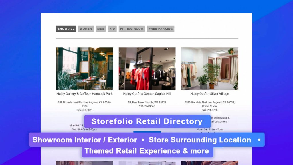
For retailers who run their businesses as brick-and-mortar and eCommerce, store finder software is probably one of the most important marketing software you can invest in – after POS.
Store Finder is a piece of software that lets you easily manage and display your retail locations in your website so you can convert your online traffic into your retail store foot traffic. Besides adding more foot traffic to your retail locations, store finder also helps you to build more credibility into your brand so customers can shop with more confidence.
If you are building your store finder page on your website and not sure how to start, here are 5 online shops who have a really beautiful photo-gallery style store finder page you can refer to.
1. STANCE
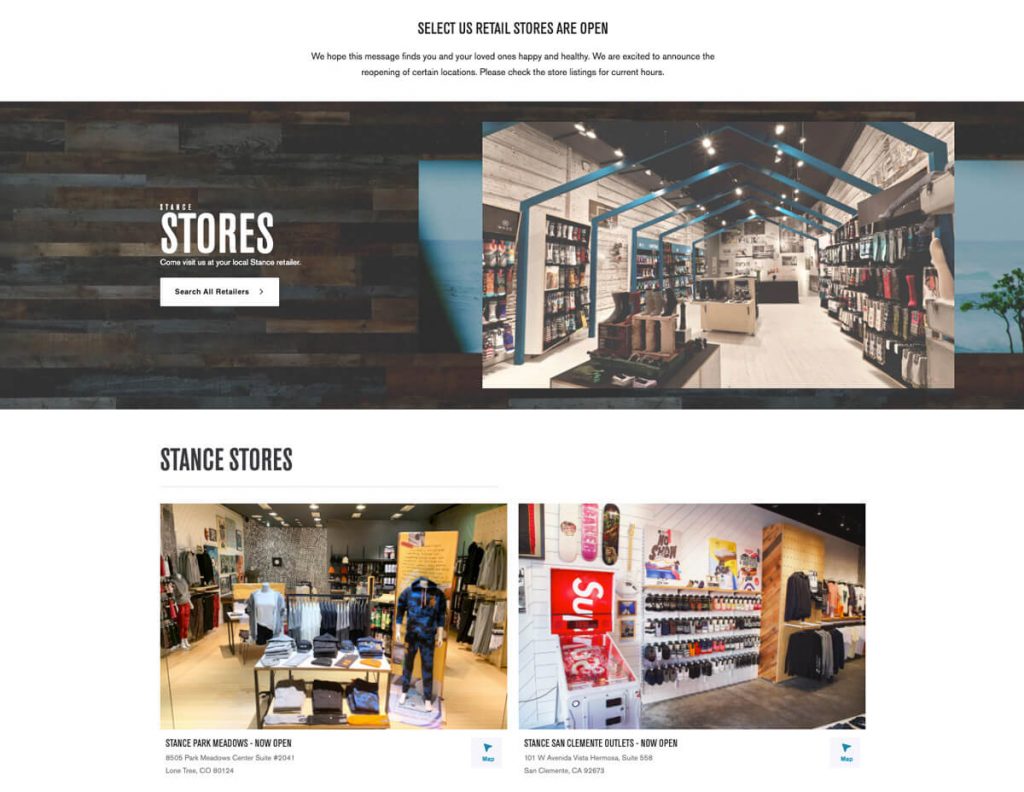
Stance is an apparel brand, especially well known for their quality socks. With 17 retail outlets spread across the country, their Stance stores page features minimal text and choose to let their outlet store photo speaks for themselves.
Stance Store page features:
- Hero banner with great brand personality
- Link to post code based retail locator
- 2-column row with big bright photos of the stores interior.
- Store address
- Link to google map for easy navigation
Interestingly, Stance also runs a separate Store locator page which lets customers search for closest store near them.
2. Buck Mason
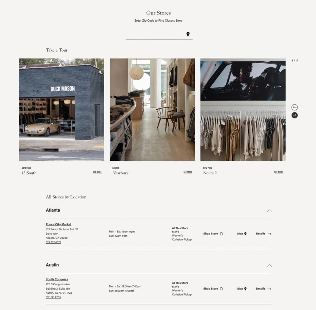
Started by two neighbours who met in Venice, California; Buck Mason is a digitally-native menswear brand that takes an architectural approach to make fashion less complicated. Buck Mason runs their business online along with retail stores in Los Angeles, New York and San Francisco.
With 50 retail locations and counting, the Buck Mason retail page took a combo design approach featuring:
- A simple store finder with zip code
- A sliding store gallery featuring 3 retail stores with great photo per set
- Followed by a full list of all stores – broken down by cities – each with details like address, working hour, map navigation, and product categories available at this store.
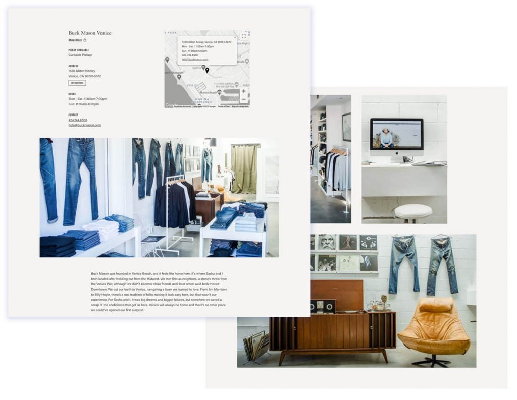
I also really like that Buck Mason takes the effort to create a standalone page for each of their store, featuring location details and more interior store photos, all are well lit and professionally taken to showcase the location’s personality.
3. Frank and Oak
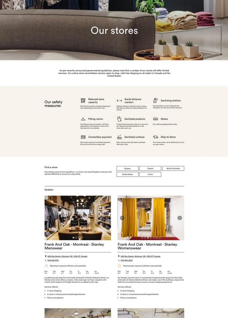
Frank And Oak was founded in Montreal in 2012, with a mission to create an apparel brand that would speak to a new generation of creatives and entrepreneurs. A certified B Corp, Frank And Oak is now a leader in sustainable fashion with 17 stores located in Quebec, Ontario, British Columbia, United States and China.
The Frank And Oak store page is neatly designed and full of helpful features:
- A prominent hero banner to give a glimpse of their retail store ambience
- An updated safety measures in response to Covid19 to give customers confidence to shop in-store
- Simple store finder based on cities / countries of the stores
- Each store features multiple photo using a sliding gallery
- It is also nice that they took the effort insert a back-story for each store, so customers can appreciate the store’s design and theme while doing their shopping there.
- Another nice feature is how Frank And Oak took the effort to label the stores that are wheelchair accessible.
4. Joybird
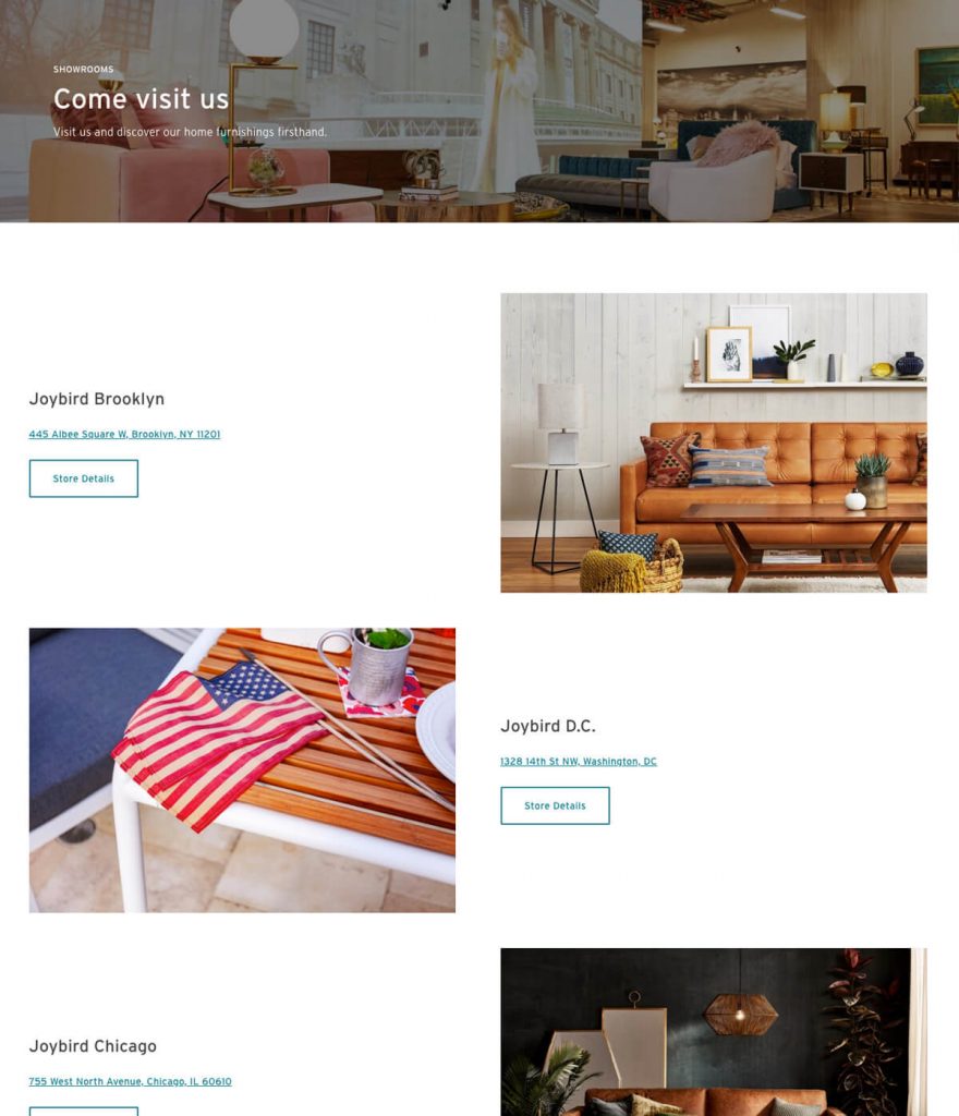
Joybird is custom home upholstered furniture brand founded on the idea that people should never settle when it comes to their home furnishing. Their Showroom page is doing an amazing job at selling themselves without cluttering the page with too much information.
What I like about Joybird’s showrooms page:
- Prominent but grey out hero banner to help focus on the title while also setting the mood
- Big, well lit photo, each with its own lighting to reflect the store’s uniqueness
- Minimal information thus no cluttering
- Each store has its own page with more details and personality – really loving this structure so far.
5. Love, Bonito
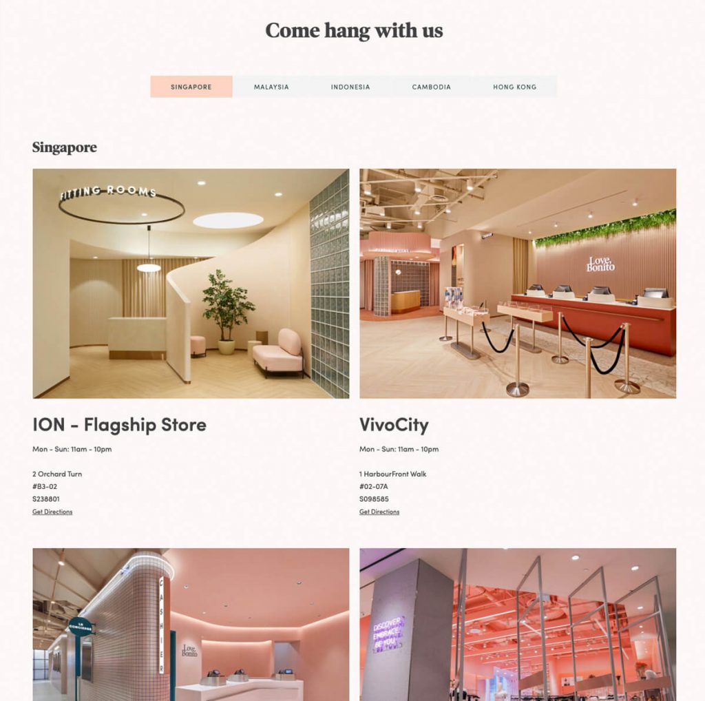
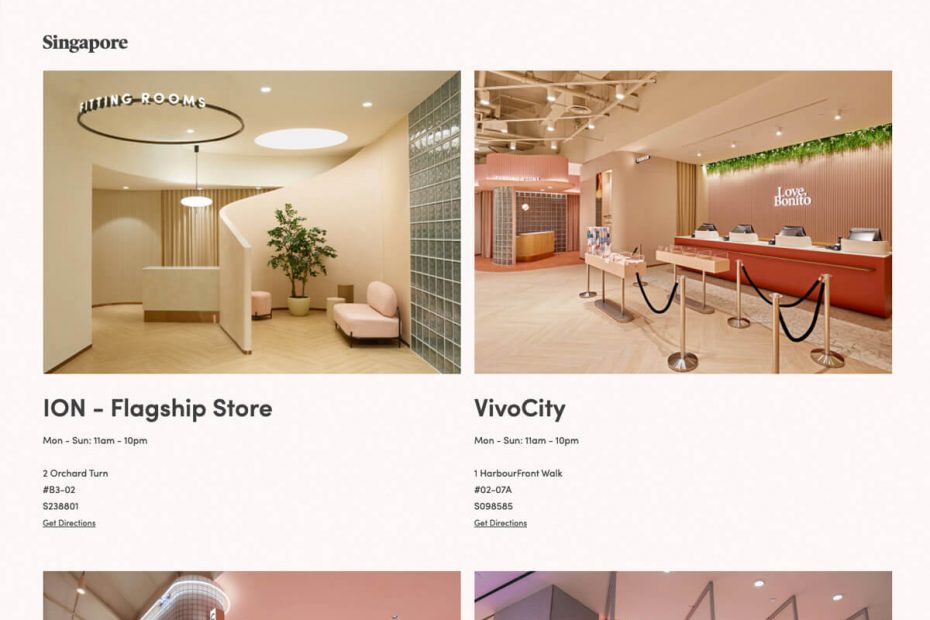
Love, Bonito is one of the largest woman fashion platform in Asia. So it is not a surprise that they have stores in multiple countries. Love, Bonito’s decision to use photo gallery style locator to showcase their retail stores shows just how flexible the photo-gallery style store locator can be.
A quick look on Love, Bonito’s stores page:
- A list of countries is shown on the very top to help visitors instantly navigate to country of their choice.
- Really big photos for each store. Looking through the photography style of each country, one can really tell the market preference and maturity. Being a Singapore brand, the photos for Singapore market emphasize on the store’s personality and features – while other markets focuses more on the abundance of product choices.
Thanks for reading! If you love this post and interested to see more design inspirations for store directory, check out my other posts below:
Creative Retail Store Directory Designs for Shopify & WooCommerce Stores
Create your own photo-album style store directory for your Shopify website – no coding needed.
Storefolio Retail Directory is designed to let you do just that. Just install it here from the Shopify App Store and you can easily upload and manage multiple retail locations.
